Accessible color and contrast
- Don't use color alone to visually convey important information.
- Make sure colors have sufficient contrast (see also Complex images)
Many people have difficulty distinguishing certain colors or colors with low contrast. Users with low vision, color blindness, monochrome screens, screen rendering problems, light interference, and other issues rely on secondary, non-color cues. In addition, as many as 1 in 8 men and 1 in 200 women have the common form of red-green color blindness (NEI).
Don't use color alone to convey important information
Add secondary cues
Never use a single color (or other sensory cues [position, shape, sound, etc.]) alone to visually convey important information.
If color transmits something meaningful on a page (such as a link, required field or active state), provide a secondary method to communicate the information. For example, one of the most common methods of indicating a link is to underline it.
| Color should not be the sole visual cue. | Use a secondary cue for users who are color blind. |
|---|---|
| What if I can't see the color red very well? | Underlining links helps users detect linked text. |
You can also use bold-face, patterns, icons, text descriptions, etc., to add secondary non-color visual cues.
Add text labels
Instructions should not rely solely on color. For instance, referring to the "red button" is confusing to users who are blind. If you use sensory indicators, also include a text identifier in the directions and as a label on the element.
| Confusing for blind or colorblind users | Add labels to directions to help users. |
|---|---|
| Click on the red button. | Click on the red "submit" button. |
| Select the green arrow. | Select the green "Next" arrow in the lower right. |
Make sure colors have sufficient contrast.
For people with color blindness and other vision problems, high-contrast text on the page and in images makes content much more legible. Try to achieve at least these visual color contrast ratios:
- Regular text must have at least a 4.5:1 contrast ratio between text and background.
- Links must have at least a 3:1 contrast ratio between link and non-link text.
| Insufficient contrast | Sufficient contrast |
|---|---|
| Low-contrast font colors make it extremely difficult for users with low or color vision deficiencies to read your content. | Low-contrast font colors make it extremely difficult for users with low or color vision deficiencies to read your content. |
For color contrast on complex images like infographics, charts and graphs, see the article on Complex images.
Color contrast of ASU brand colors
You can test ASU brand color combos for compliance with WCAG using this handy ASU Contrast Grid created by Victoria Polchinski of Enterprise Technology's UX Research.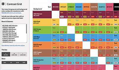
How to test
Manually evaluate several pages (the homepage, a representative internal page and any pages that contain unique elements). If color visually conveys important information, ensure that an alternative method of conveying that information is present, including secondary cues and textual directions or labels.
A quick way to evaluate contrast is to take a screenshot of a page and change it to black and white. If elements are difficult to distinguish, increase the contrast ratio.
Contrast checkers
- WebAIM's color contrast checker
- Color Contrast Analyser (Windows and Mac)
- Color Contrast Analyzer (Chrome)
- WCAG Contrast Checker (Firefox)
Relevant W3C WAI documents
- WCAG 1.3.3 Sensory Characteristics: Instructions provided for understanding and operating content do not rely solely on sensory characteristics of components such as shape, size, visual location, orientation, or sound.
- How to Meet WCAG 1.3.3
- WCAG 1.4.1 Use of Color: Color is not used as the only visual means of conveying information, indicating an action, prompting a response, or distinguishing a visual element.
- How to Meet WCAG 1.4.1
- WCAG 1.4.3 Contrast (Minimum): The visual presentation of text and images of text has a contrast ratio of at least 4.5:1.
- How to Meet WCAG 1.4.3