Keyboard access
Basics
- Ensure you can tab to every link, button and form control and access all content and functionality using the keyboard only.
- Structure the source code to reflect the logical navigational (tabbing) order.
- Use ARIA properties or roles or the TABINDEX="0" attribute to ensure an element can receive keyboard focus.
- Focus states should be clearly visible. If an element changes on hover or onMouseOver, ensure that it also changes on focus.
In-depth
Keyboard accessibility is one of the most important aspects of web accessibility. Users who are blind, who can't see the cursor clearly, or who have limited or no use of their hands cannot use a mouse and rely on a keyboard or keyboard-like devices to navigate a website. For instance, many people with impaired vision use screen readers, a type of software that uses synthesized speech or refreshable Braille output to read a web page and is operable by keyboard only.
If all functionality on the page is operable through a keyboard, it will likely be accessible by most assistive devices.
Default tab order
By default, users can tab to links, buttons, and form controls. This means users should be able to navigate to all interactive elements on the page using the tab key. Tabbing will follow the structure of the document, even when the order displayed on the screen is altered by CSS. Therefore, the source code should always reflect the logical navigational order.
Focus
Use keyboard-accessible HTML elements (links, buttons and form controls) whenever possible. For example, rather than divs styled as buttons, use the semantically correct HTML <button> element.
If it's not possible to use a natively accessibile element, you can use ARIA to ensure an element can receive focus. For instance:
- Using the ARIA tabindex property will add the element to the tab order of the document and ensure it's able to receive focus.
<div id="menu-container" tabindex="0"> - Defining an ARIA-role attribute for an element can make it focusable. (See more about WAI-ARIA.) For instance, adding ARIA-role="button" to a <div> assigns the element a new role of button and makes it focusable.
<div class="button" aria-role="button">Go back</div>
Visible focus state
Locating where you are on a webpage can be difficult for anyone, but is particularly troublesome for users with low vision.
- When an element has focus, make sure the focus state is clearly visible.
- Never use CSS to remove the outline from links, unless you intend to replace it with a more visible focus state cue.
- If an element changes on hover or onMouseOver, ensure that it also changes on focus.
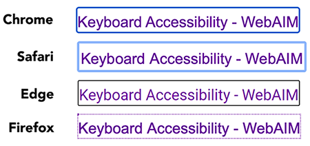
The default visible focus states in major browsers:

Javascript
Javascript is not necessarily inaccessible. When carefully written, Javascript functionality can be keyboard accessible. See the Javascript guidelines for creating keyboard-accessible Javascript.
How to test
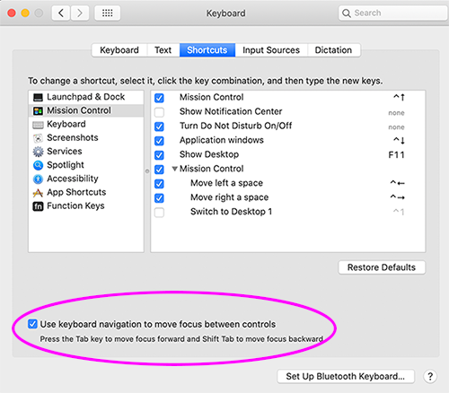
If you are on a Mac, you'll need to enable keyboard access in System Preferences > Keyboard > Shortcuts:

Keyboard Shortcuts
To navigate your page using only the keyboard, use these keyboard shortcuts.
| Action | Keys |
|---|---|
| Navigate forward to focusable elements | Tab |
| Navigate backward to focusable elements | Shift + Tab |
| Move forward and backward to top-level menu items on a dropdown menu |
Tab / Shift + Tab |
| Move inside a dropdown submenu | Up/Down Arrows |
| Move into and out of a group of tabs | Tab |
| Move forward and backward among tabs | Left/Right Arrows |
| Close or leave a modal dialog | Escape |
| Select buttons | Spacebar or Enter |
| Select a link | Enter |
| Select radio buttons | Arrows |
| Select checkboxes | Spacebar |
| Select/deselect options in a select list | Enter |
| Navigate within a select list | Arrows |
| Expand a select list | Spacebar or Down Arrow |
Keyboard-only navigation test
- Click the address bar in your browser, to set the cursor there.
- Begin tabbing through the page ensuring that:
- A "Skip to main content" link is the first element you encounter
- You can navigate to every link, form control and button in logical order.
- Each element you tab to visibly displays focus.
- You can view all tooltips and navigate all tabs, popup windows, slideshows, carousels, menus and other widgets and features.
Relevant W3C WAI documents
- WCAG 2.1 Guideline 2.1.1 Keyboard: All functionality of the content is operable through a keyboard interface without requiring specific timings for individual keystrokes, except where the underlying function requires input that depends on the path of the user's movement and not just the endpoints.
- How to Meet WCAG 2.1 Guideline 2.1.1
- WCAG 2.1 Guideline 2.1.2 No Keyboard Trap: If keyboard focus can be moved to a component of the page using a keyboard interface, then focus can be moved away from that component using only a keyboard interface, and, if it requires more than unmodified arrow or tab keys or other standard exit methods, the user is advised of the method for moving focus away.
- How to Meet WCAG 2.1 Guideline 2.1.2
- WCAG 2.1 Guideline 2.4.3 Focus Order: If a Web page can be navigated sequentially and the navigation sequences affect meaning or operation, focusable components receive focus in an order that preserves meaning and operability.
- How to Meet WCAG 2.1 Guideline 2.4.3
- WCAG 2.1 Guideline 2.4.7 Focus Visible: Any keyboard operable user interface has a mode of operation where the keyboard focus indicator is visible.
- How to Meet WCAG 2.1 Guideline 2.4.7