For everyone
Alternative descriptions of complex images
Like other images, complex images require equivalent text alternatives that describe the content, function and/or purpose of the image. These text alternatives are critical for people using screen readers and others who aren't able to access your images because of vision or cognitive impairments. People with slow Internet connections or old technology also benefit from text alternatives.
Use the ASU Online Image Description Generator to easily generate alt text and long descriptions.
The process of adding alternative text for complex images is more involved than for simpler images. In most cases, alternative text for complex images consists of three parts:
- ALT attribute (sometimes called ALT tag): a short description that summarizes and identifies the complex image, graph or chart
- Location of the long description
- Long description: detailed description of the image in text or table form
ALT attribute
Like other images, ALT attributes for complex images summarize the purpose or importance of the image. Data visualization designer Mary Cesal suggests a simple formula for writing ALT text for graphs, charts, and other complex images--
![]()
And she gives an example:
A line graph of the number of bananas sold per day in the last year where the winter months have more banana sales.
Location of the long description
Once you've summarized the complex image in the ALT text, next add the location of the long description. You can direct people to the long description by (a) providing a link to it or (b) describing where it's located if it's on the same page, as illustrated in the following.
Link to the long description
Often the easiest way to direct users to the long description is to supply a text link to it. Close to the image (often just below it), add a link to the long description (the long description can be elsewhere on the same page or on another page). For example, the link directly below this bar graph takes the user to a data table describing the chart.
Describe the location in the ALT text
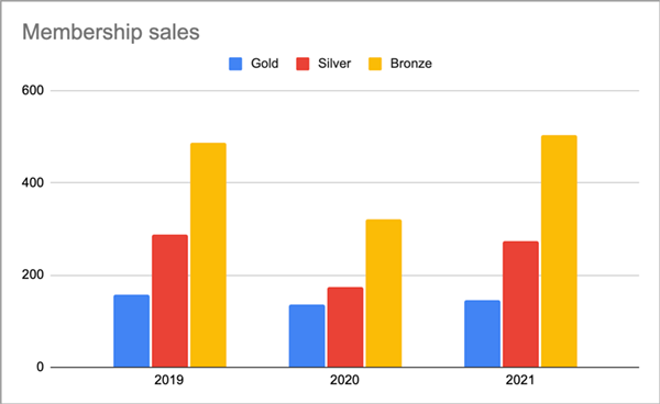
Alternatively, you can add the long description elsewhere on the same page (often at or near the bottom), then identify its location in the ALT text. For the above bar chart, our alternative text might be:Bar graph of membership sales for 2019-2021 showing 2021 sales returning to pre-pandemic levels. See details below under the Resurging sales 2021 heading.
Long description
Complex images like infographics, graphs and charts usually require more description than can be provided in the image's ALT attribute. Therefore, complex images are almost always given a separate long description. Depending on the type of image, long descriptions can be text-based or a data table.
Text-based long description
WebAIM's Web Accessibility for Designers infographic is a good example of a complex image with a long description in list form. Notice WebAIM didn't describe any visual aspects of the image, not even the icons, considering them unnecessary to an understanding of the main points of the infographic.
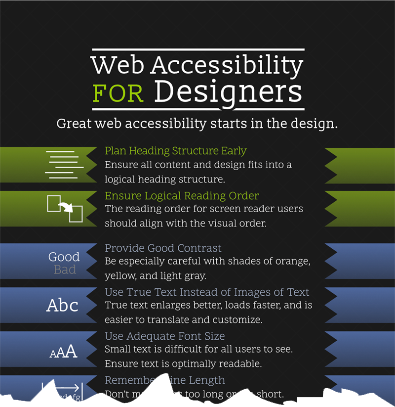
They placed the long description for this image directly below the image, and the image's ALT text points to that location:alt="Web Accessibility for Designers infographic with text description below."
The text description, or long description, is in list format. Here is a portion of the long description, taken from the WebAIM site:
Text Version
Plan Heading Structure Early
Ensure all content and design fits into a logical heading structure.
Ensure Logical Reading Order
The reading order for screen reader users should align with the visual order.
Provide Good Contrast
Be especially careful with shades of orange, yellow, and light gray. Check your contrast levels with our color contrast checker.
Use True Text Instead of Images of Text
True text enlarges better, loads faster, and is easier to translate and customize.
Use Adequate Font Size
Small text is difficult for all users to see. Ensure text is optimally readable.
Data table long description
Often, the content of charts, graphs and infographics lends itself better to a data table long description. For example, on the What is accessibility? page on this site, a complex illustration from Microsoft is linked to its long description with a "View text version" link under the image:

The link takes the viewer to a long description in data table form:
| Permanent | Temporary | Situational | |
|---|---|---|---|
| Touch | One arm | Arm injury | New parent (holding baby) |
| See | Blind | Cataract | Sunlight glare |
| Hear | Deaf | Ear infection | Bartender (loud music) |
| Speak | Non-verbal | Laryngitis | Heavy accent |
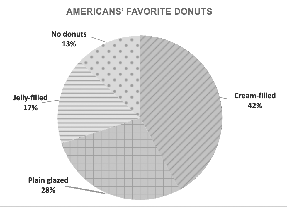
Don't use color alone to convey information on charts and graphs
Many people have difficulty distinguishing certain colors or colors with low contrast. Users with low vision, color blindness, monochrome screens, screen rendering problems, light interference, and other issues rely on secondary, non-color cues.
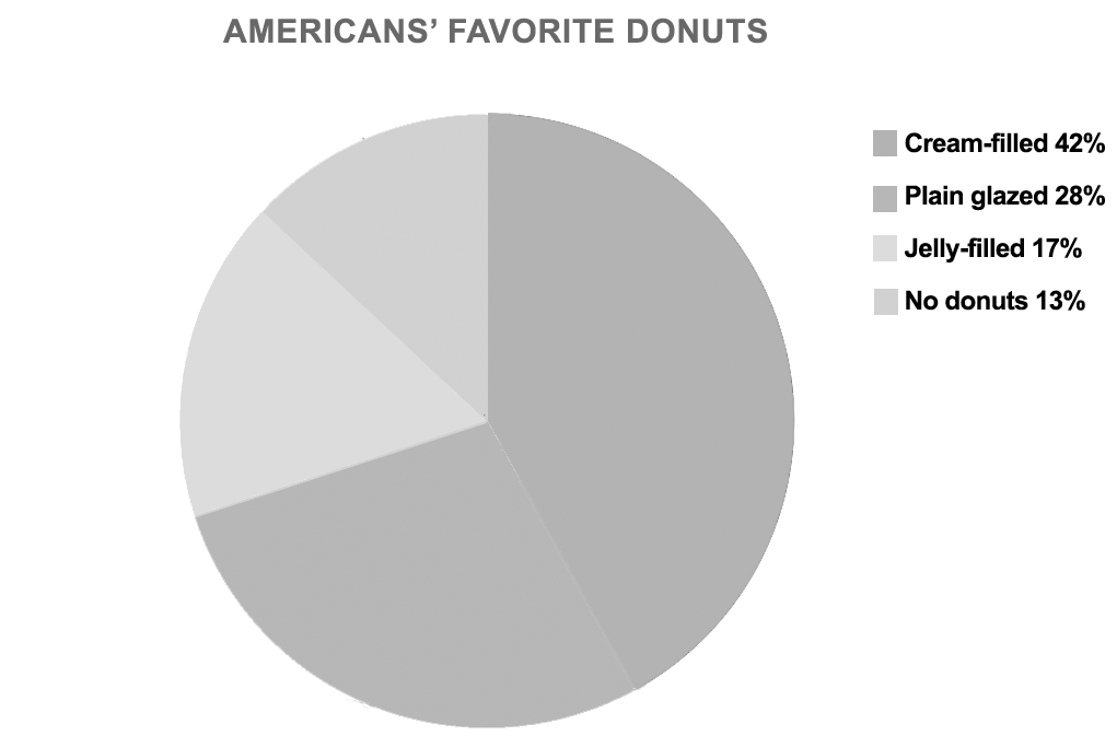
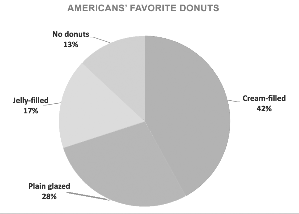
This pie chart is inaccessible for several reasons. First, because the colors have so little contrast, the segments of the chart will be indistinguishable for many people with color blindness and vision impairments. In the grayscale version directly below, you can see how the cream-filled and plain glazed segments are practically identical, as are the jelly-filled and no donuts segments.
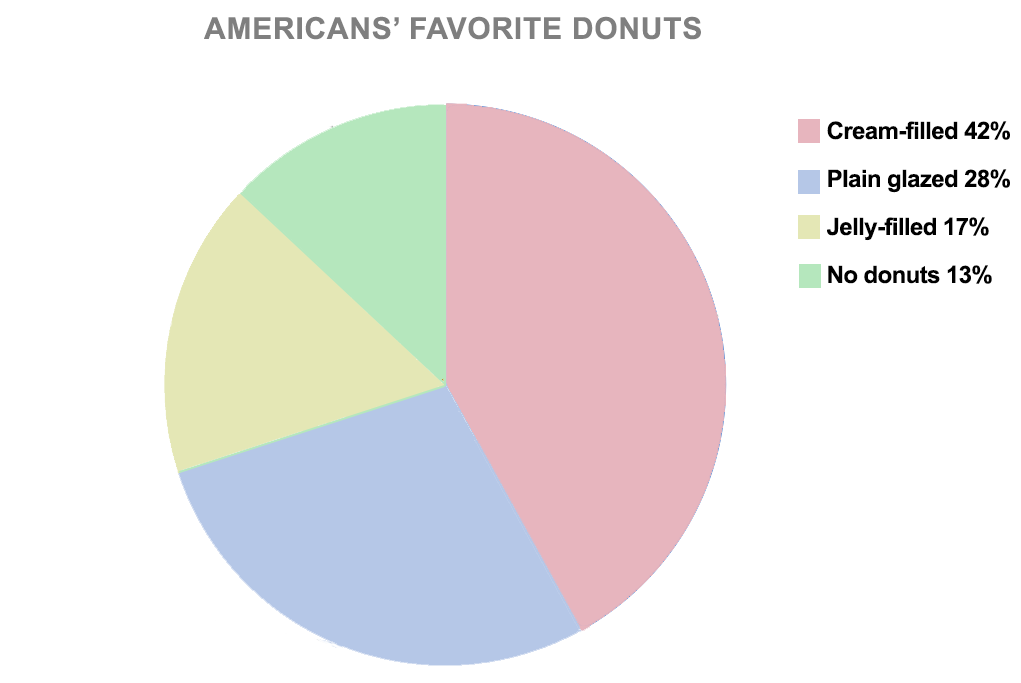
Second, legend keys are much less effective than directly labeling the parts of a chart or graph. In this case, because the colors are so similar, many people won't be able to associate the labels with sections of the chart. Most will simply have to guess what information they were supposed to receive from this pie chart.
Direct labels
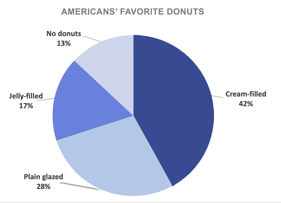
Adding text labels directly to the segments is imperative on charts and graphs. It makes it easier for the user to visualize the data and the relationships between data. However, for this chart, even labels don't help enough. The color contrast ratios are simply too small.
High-contrast ratio colors
One way to increase the distinction between colors on a chart is to use colors with higher contrast ratios. As you can see in the chart in grayscale, below, the individual segments are much more distinctive.
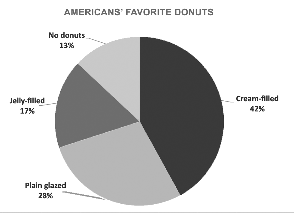
Using colors with a higher color contrast ratio is a vast improvement and could be relied on in most cases. However, there are many types of color blindness and vision disorders. If you need to guarantee that everyone will be able to understand the graph or chart equally, consider using patterns and/or shapes.
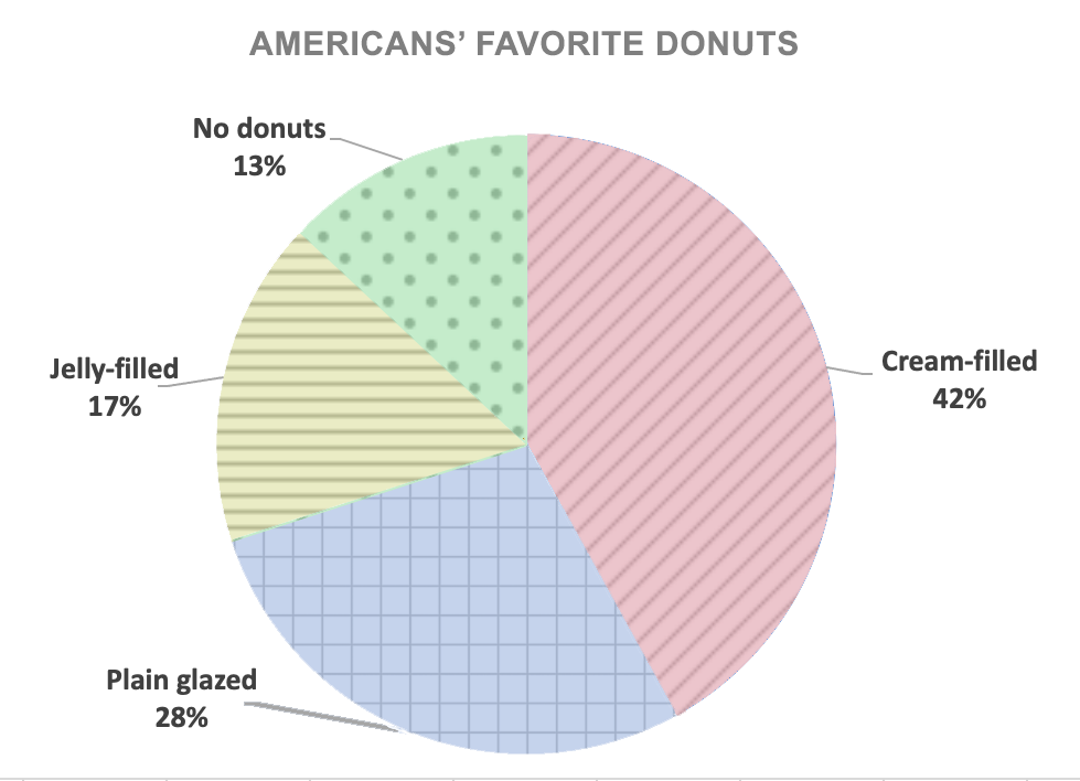
Patterns and shapes
One of the best ways to supplement colors is with patterns and shapes. As you can see in the grayscale version below, the addition of patterns clearly delineates the segments of the pie chart.
Consider patterns and shapes when dealing with other types of graphs, as well. One of the best representations of this concept is a line graph on the ASU Library site.
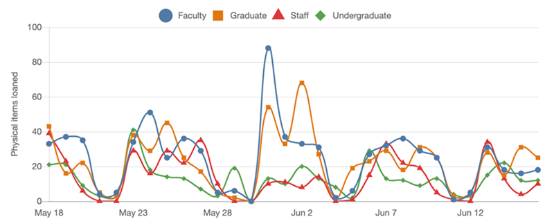
Rather than relying on color alone to distinguish each data line, the developer choose to add varying shapes on each line, further assuring that everyone in their audience can understand the information being conveyed.
The line graphs on that page are also worth looking at for the clever and unobtrusive hide-show drawer used to include the graphs' text alternatives directly on the page beside the visual graphs.
Alternative text version of the "Membership sales" table
| Gold | Silver | Bronze | |
|---|---|---|---|
| 2019 | 158 | 289 | 487 |
| 2020 | 136 | 174 | 321 |
| 2021 | 146 | 273 | 504 |