For everyone
Write to communicate. Clear, concise writing takes skill and time, but the benefits to your readers are profound.
Most people don't read closely on the web. Instead, they skim over content, searching for just the information they need. Text that is brief, to the point and well organized not only helps everyone but is crucial for people with reading, memory and attention deficit or other cognitive conditions and those who speak English as a second language.
Simple, concise language
Edit your content to make it as understandable and succinct as possible:
- Use short, simple sentences.
- Try to keep paragraphs to one main idea.
- Cut or condense what 4 Syllables calls "wordy writing, repetition, and low-value content" such as welcome messages and "introductions that state the obvious or repeat information that appears further down the page".
- Use descriptive and unique link text (e.g., “Chapter 2 on biometrics” rather than “chapter” or “click here”).
- Clarify your text with images or video.
- Avoid jargon and ambiguous, obscure or complex words and phrases.
- Avoid idioms, such as "piece of cake" and "sit on the fence".
- Spell out abbreviations and acronyms the first time they are used.
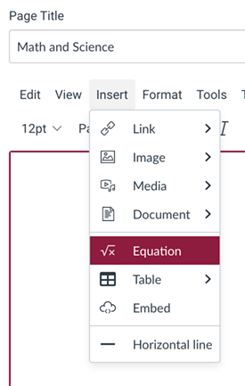
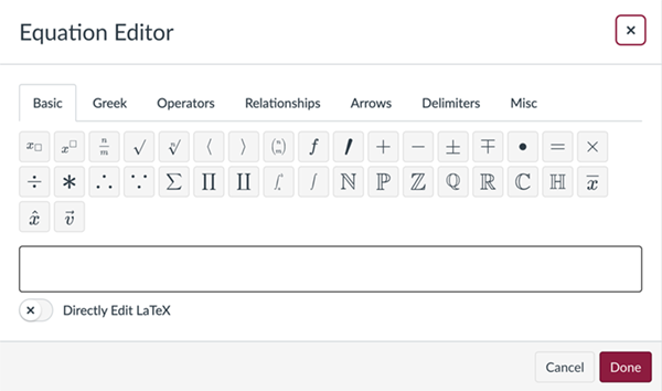
- Use the Equation Editor in Canvas' Rich Content Editor.
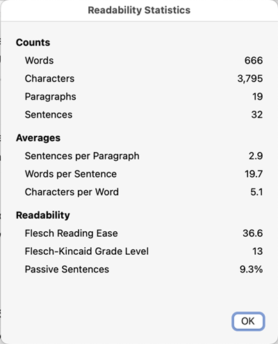
- Copy and paste your content into MS Word. Then follow these instructions to generate Readability Statistics:
Or you can use free online checkers like:
Organize and structure content
- Group related ideas under hierarchical headings to organize content, to establish relationships between chunks of content and to visually break up large, daunting chunks of text.
- Use numbered or bulleted lists, which are easy to scan and comprehend. Use bullet lists to arrange related items; numbered lists indicate a process.
Clear instructions
Don't assume people know what you want them to do on your site or course. Provide simple, clear instructions, help tips and error messages. Avoid jargon and technical terms. Describe form input requirements, such as date and phone number formats.
| Unclear | Clear |
|---|---|
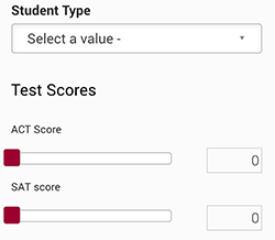 | 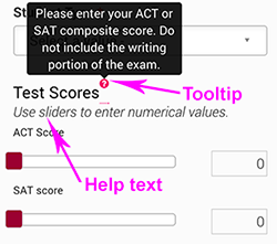 |
Disability Language Style Guide
For a guide on writing about disabilities, please refer to the Disability Language Style Guide provided by the National Center on Disability and Journalism and ASU's Walter Cronkite School of Journalism and Mass Communication.